Background

Propeller is a tool to help people manage their asthma or COPD by tracking different aspects of their condition. Sensors attached to inhalers to track medication consumption, and the app allows for manual tracking of medications, symptoms, and triggers. Each health input is recorded as an Event and can provide insights directly to the Propeller smartphone app.

Rebuilding Propeller to serve the needs of respiratory patients

When I first started at Propeller, I conducted an audit that helped me understand the product better and to learn context and history surrounding feature decisions, which would be very important when it came time to involve engineering. We assembled a small team to reimagine the app using the design thinking process.

Suggested changes with various other initiatives to help it get buy-in, several features developed through this this process were aligned with suggestions from a pharma client, Chiesi. Using our contract with Chiesi and accessibility requirements that we needed to meet for legal reasons, we were able to prioritize a significant redesign of the app.


Roles

UI/UX Design
User Research
Visual Design

Deliverables

Research
User Flows
Wireframes
High Fidelity Screens

Tools

Balsamiq
Sketch
Invision


Audit Results


Original Home Feed.png

The results of both my audit and the official third party accessibility audit revealed a lot of failures in the app. In terms of visual design, both the default font color and brand color that was used for buttons and other text labels did not meet WCAG AA contrast requirements. Certain icons were difficult to distinguish from each other.

The Today tab consisted of a central feed of cards with different functions included marketing content, information regarding disease or programs, as well as functional messages such as bluetooth connectivity. It created confusion around messaging and hierarchy while redundant and low value information take up too much room in the feed

The Trends tabs also had a confusing design and used an uncommon display for data, patients were frequently confused by adherence information.


The Team

Screen Shot 2021-10-05 at 3.51.06 PM.png

I was the Lead Designer on this project, assisting on research, creating wireframes, high fidelity screens, prototypes etc. Sr. Product Designer Annie (2nd) led this initiative and oversaw the initial design exercises. Director of Clinical Innovation Melissa (3rd) and User Researcher Kelly (4th) were our subject matter experts and provided clinical and research knowledge.


Empathy Mapping

Post its.png
 
Empathy Map.png
 

Figuring out user needs

Putting ourselves in the shoes of someone with asthma or COPD, we wrote down various thoughts, emotions, and actions that a patient might have or do. We then used Affinity Mapping to better understand patients and derived several personas to create a patient journey.


Patient Personas

Patient-Asthma1.png

Using the results of the Affinity Map and prior research, we updated the user personas to better reflect our new understanding of patients.


Normally, the next step would be to create a user or patient journey. In our case, because we offer our sensors for free in partnership with different health systems and agencies, this leads to differing experiences in our app depending on the funnel a patient has gone through. In order to account for this, we identified the major differences and categorized them into 3 tracks. We brought the patient personas through each track to identify the positive and negative moments. 


WireFrames

Screen Shot 2021-10-05 at 4.15.45 PM.png

Afterwards, we moved into the wireframing portion. This is where I took the results of the previous work to create rough design concepts. No idea was off limits and we were designing for our northstar. So I felt free to rethink what went into our navigation, including adding major features such as an education and notifications section and to not be constrained by what the app looked like.


Information Architecture

This is a visualization of the proposed architecture using high fidelity versions of the wireframe concepts. As you will see later though, the scope of the project will narrow considerably, which includes no changes made to the bottom navigation. However, at this stage, it was important to map what future changes we thought would be the most impactful, and this exercise will help serve to reinforce it and drive work later down the line such as a ongoing initiative to include more robust education within the app.  


A/B Testing

At this stage, we had presented our project to our VP to get buy-in to move forward with the next step, which was to conduct user research. We tested two versions of an asthma and a COPD app for a total of 4 iterations. Designs were group into and A and B version to test organizational directions around the Today, Timeline, and Trends tab.

Testers were recruited through a 3rd party and moderated tests were performed on-site with a clickable prototype facilitated by Kelly, the user researcher. As the designer, I sat in to take notes and observe. These experiences would be necessary for me to improve my research skills, coming from a visual arts background.


Today Tab

A Med grouping good for manual logging and nice way to see an overview of your day vs B focus on more ‘what do I have to do today’ and good for checking and reminding throughout day 

A: Expect the albuterol card to have the times you took it listed to be consistent with the other med cards 

B: Confusion/overwhelmed by the controller med circle rings at top; ex: “maybe it means “how good I was?”

Trends 1 Week.png

Trends Tab

More mixed responses on preferences.

Those who liked A liked that there was less clicking to access and could see rescue and controller graphs together to compare

Those who liked B liked it since avoided long scrolling and gave them the chance to choose what the specific thing they wanted to see


Timeline Calendar.png

Timeline Tab

All but 1 preferred the calendar view, even despite the confusion it caused, ultimately they liked the at a glance feel

A: Expects to be able to edit entries, disliked the scrolling

B: Likes calendar as a concept since helpful to see overview and find a specific day, but all participants run into issues understanding it


After conducting the user tests, we adjusted designs based on feedback and created a clickable prototype in Flinto to help demonstrate the new designs, in particular the architecture changes, to key stakeholders. 

Project Prioritization

After receiving buy in from Product Managers, I worked with the patient experience PM to present the changes to the development team to further adjust designs based on technical requirements.

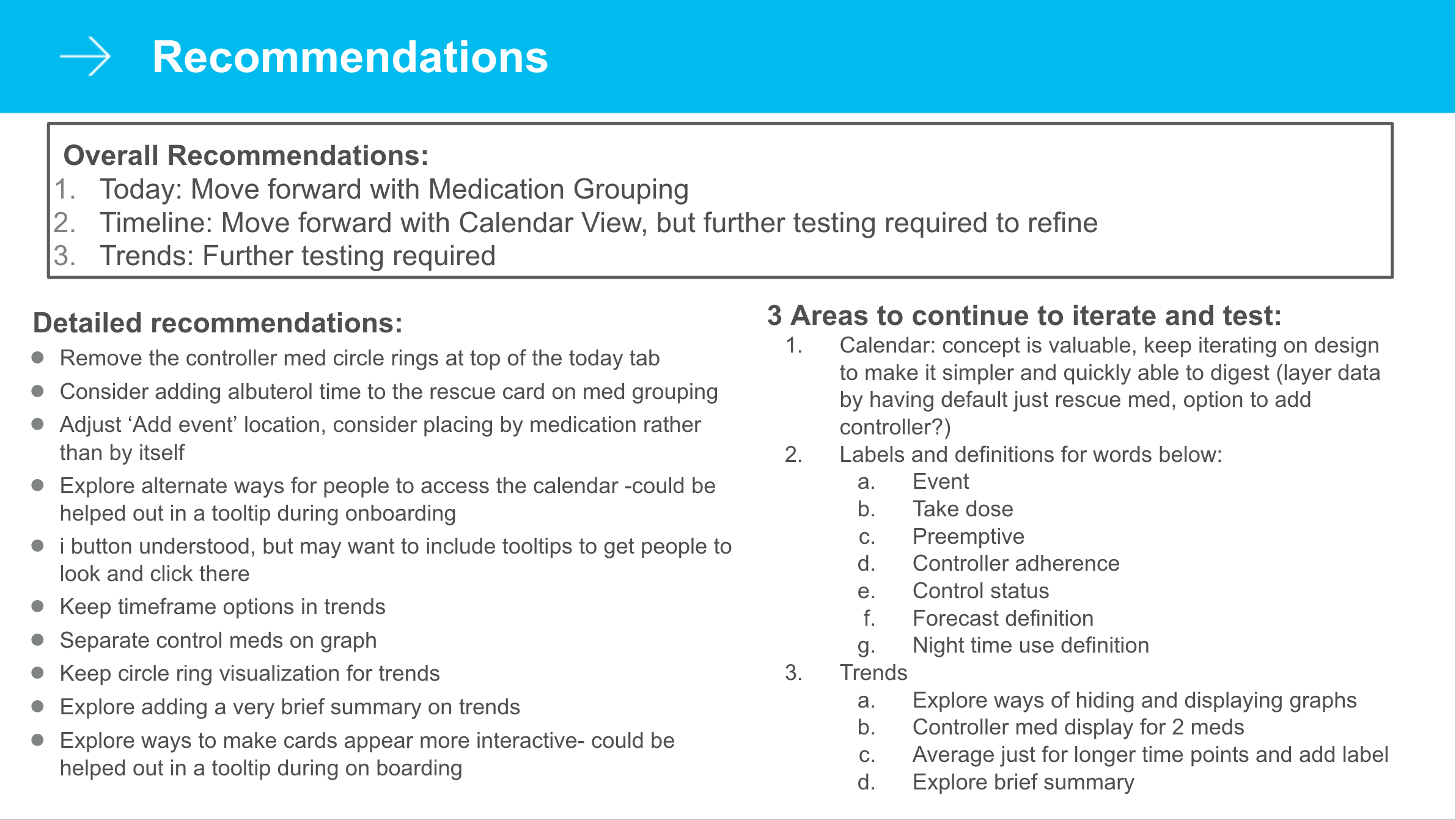
Having completed research and compiled results, we presented them to the larger product and engineering team, finally pushing our work across the threshold into seriously starting development. The patient experience squad was the natural place for this work to land, so while Annie, Kelly, and Melissa transitioned off the project, my new team members became the product manager and the engineers.


Design-Development Process Changes

Prior to joining Propeller, designs were passed onto developers using JPGs attached to JIRA tickets with assets organized in Google Drive. 

I introduced Zeplin as a tool to improve the handoff to developers which included some developer orientation and adoption. 

Afterward, individual zeplin projects are created for each phase and for each platform including style guides to ensure assets are readily available accessible. Designs were more accurately implemented and the process for updating assets was markedly improved after we implemented use of Zeplin.

After joining Propeller, I also introduced a number of tools to our design and development team. While sketch was being used in a limited capacity, I pushed for the team to completely switch over from using Adobe Illustrator as the primary design tool. I also introduced using Zeplin to help developers in implementing designs more accurately. Previously, jpegs were sent in slack or attached to tickets and google drive folders need to be created for image assets. This helped to greatly simplify and streamline the development process and allowed designers to support engineers as they implement features.


Implementing Designs


The app has a long development history for a niche market and a small user base with a lot of custom experiences built for different clients and partners. This means that despite its simple exterior, the code underneath the hood is complicated. Feature prioritization reduced the scope of the project down to a visual redesign of the complete app as well as major feature work on the Today and Trends tab. Implementation is broken down into 3 phases.


Phase 1: Accessibility and Visual Design

Because we were required to meet certain accessibility levels through a contractual agreement, the first phase of work involved a visual reskin of the app to implement a new style that adhered to WCAG AA Accessibility requirements.


Phase 2: Today and Trends Tab

The purpose of the feed in the Today tab was to convey daily updates as well as other information such as system notifications. Work on this page involved making manual medication tracking more accessible and making the default card more flexible and robust and to expand to hold more information. 

In the Trends tab, patients now have more options in viewing their data with the addition of 7 day and 30 day options and a date range selector. Custom data displays that were frequently misinterpreted were replaced with modified 3rd party chart plugins to scale with future datasets and allow flexibility in development.


Phase 3: Devices

This third phase was deprioritized after implementing Phases 1 & 2. After additional functions were added to the old devices tab made that page increasingly dysfunctional, work restarted on redesigning the organizational structure.