Background
Hive is a B2B enterprise level machine learning platform for machine learning. Taking large amounts of data, we set up projects for our globally distributed workforce to label. We then take the results and put them into our models to train computers on visual recognition tasks
Roles
UI/UX Design
User Research
Visual Design
Deliverables
Research
User Flows
Wireframes
High Fidelity Screens
Tools
Balsamiq
Sketch
Invision
Defining the Problem
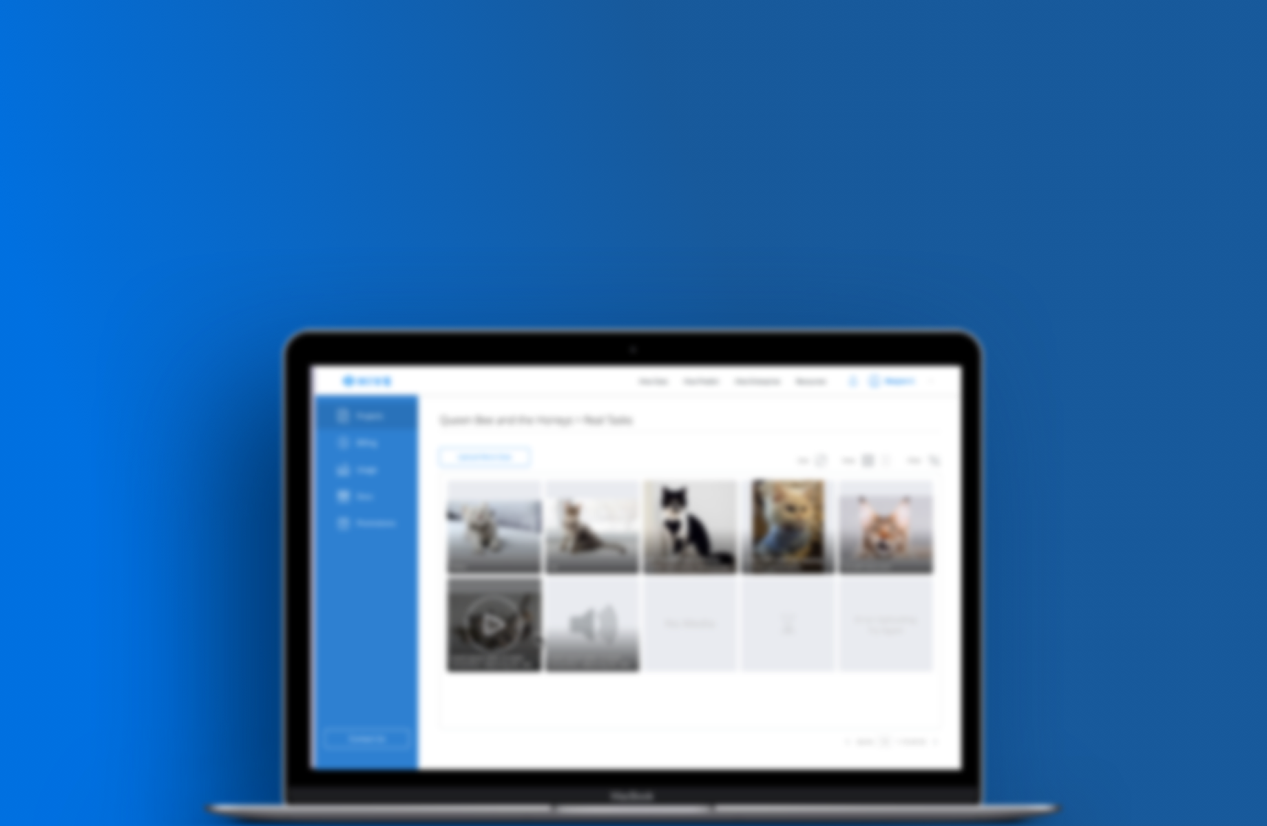
The machine learning projects that run through Hive are typically image based and users need the ability to quickly audit the results.
Tables are used most often to view a limited amount of tasks such as for honeypots. In general, users would want to be able to see the visual results without having to go into the edit mode.
While not the primary goal, meta data attached to tasks such as status, date created, etc, must all be accessible as well.
Current Pain Points
- Thumbnails are too small which required the user to go into edit mode to view in more detail, it can get tedious if there are a lot of images
Adjustable cells makes the table dimensions vary
Columns displayed all the information, which contributes to the variation in table dimensions
CTA's are less visible below the table
User Journey
Analogous Products
I looked at how other systems handled large amounts of files, namely the MacOS Finder and Dropbox. They both used card and row views to give users flexibility in how they wanted to view their files.
Information Architecture
Wireframes
I created wireframes of different layouts for card and row options as well as options for viewing the images in more details and expanding textual information.
In the wireframes, I also experimented with different placements for buttons and different systems for filtering.
A/B Testing
From the wireframes, I selected two versions for displaying visual and text information. I polled the users who use our tools the most: our data scientists, client services, and developers.
Task Information
About 60% of users preferred Option A, a popover, over Option B, expanding cells.
Cited reasons: easier to use, let's them see on the info they want rather than everything
Image Display
About 90% of users preferred Option B, card resizer, over Option A, a lightbox.
Cited reasons: less work to view images, can scroll through instead of having to click on each one
Visual Explorations
Visual Designs
Empty State
No content feature would be complete without an empty state. While an enterprise site is typically very professional, there are areas to add illustrations to liven up the designs and encourage the user to take action.
Row View
Users are able to see all the metadata of their tasks with popovers for particularly long strings. An overflow icons contains functions such as editing and deleting.
Card View
With cards, users can now easily audit their images. A resized allows them to change the dimensions to suit their needs. An enlarged 1-card view is particularly useful for detailed results.
Filters
Projects can have thousands of images, being able to filter is essential. There are different filters that will depend on the type of task as well as the category of project.
What I Learned
In this project I learned how to build tools for more technical goals. Previous to this, the features I developed were largely consumer based, with flows that I was familiar with using such as buying items or changing my payment info.
In order to service our users, I created journey maps to understand the needs and touch points, as well as the different scenarios that this feature would be used in.
If I were to continue with this project, I would want to redesign the entire page to accomodate a larger table design as well as more robust filtering options to give users more control over their search results.