Redesigning the Hive Data Export Function
Hive AI is a machine learning platform that gives businesses the tools to integrate visual intelligence into their operations and universities the platform to accelerate their research. The large amounts of data is generally handled via CSV. While there are basic tools in the dashboard to view the data, a user may want to export it to see in more granular detail.
The Previous Design
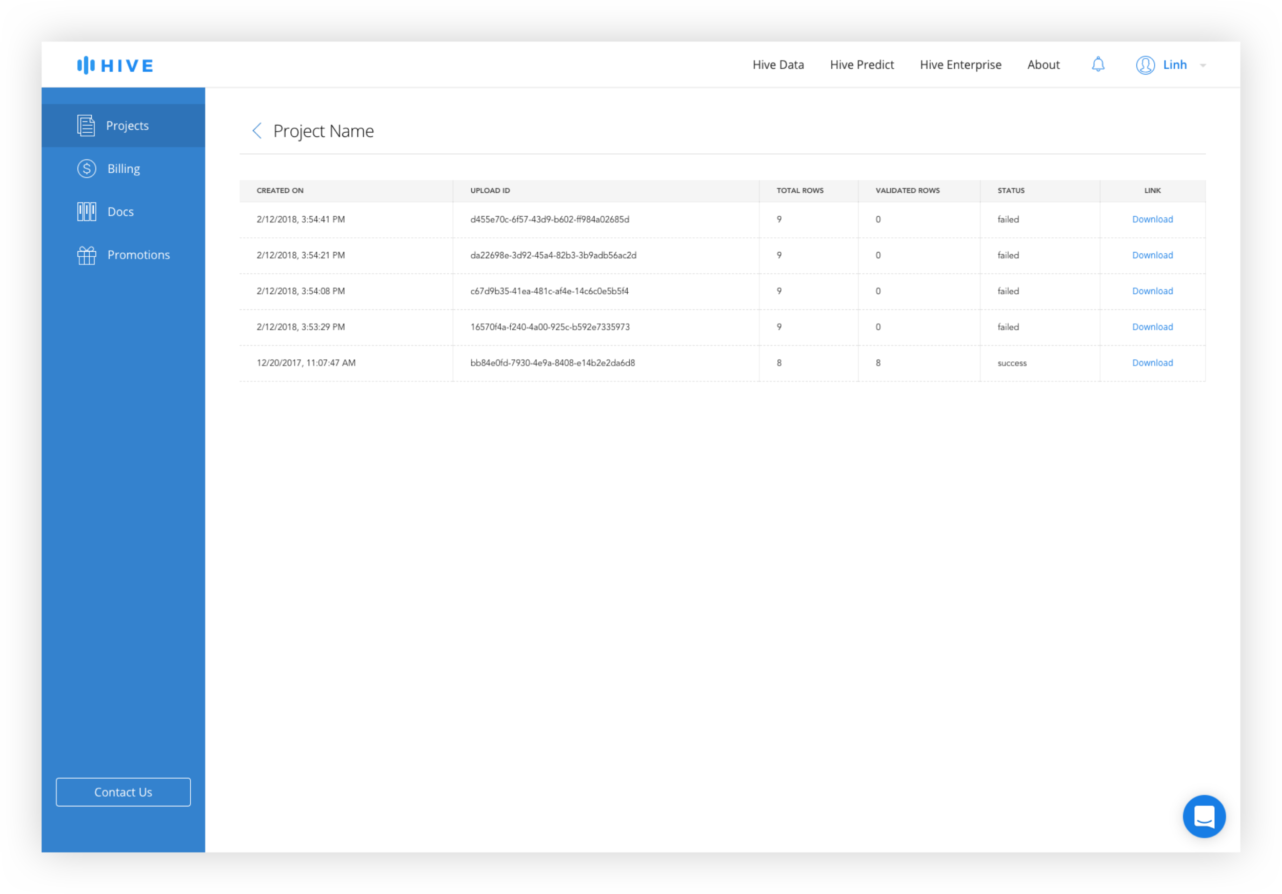
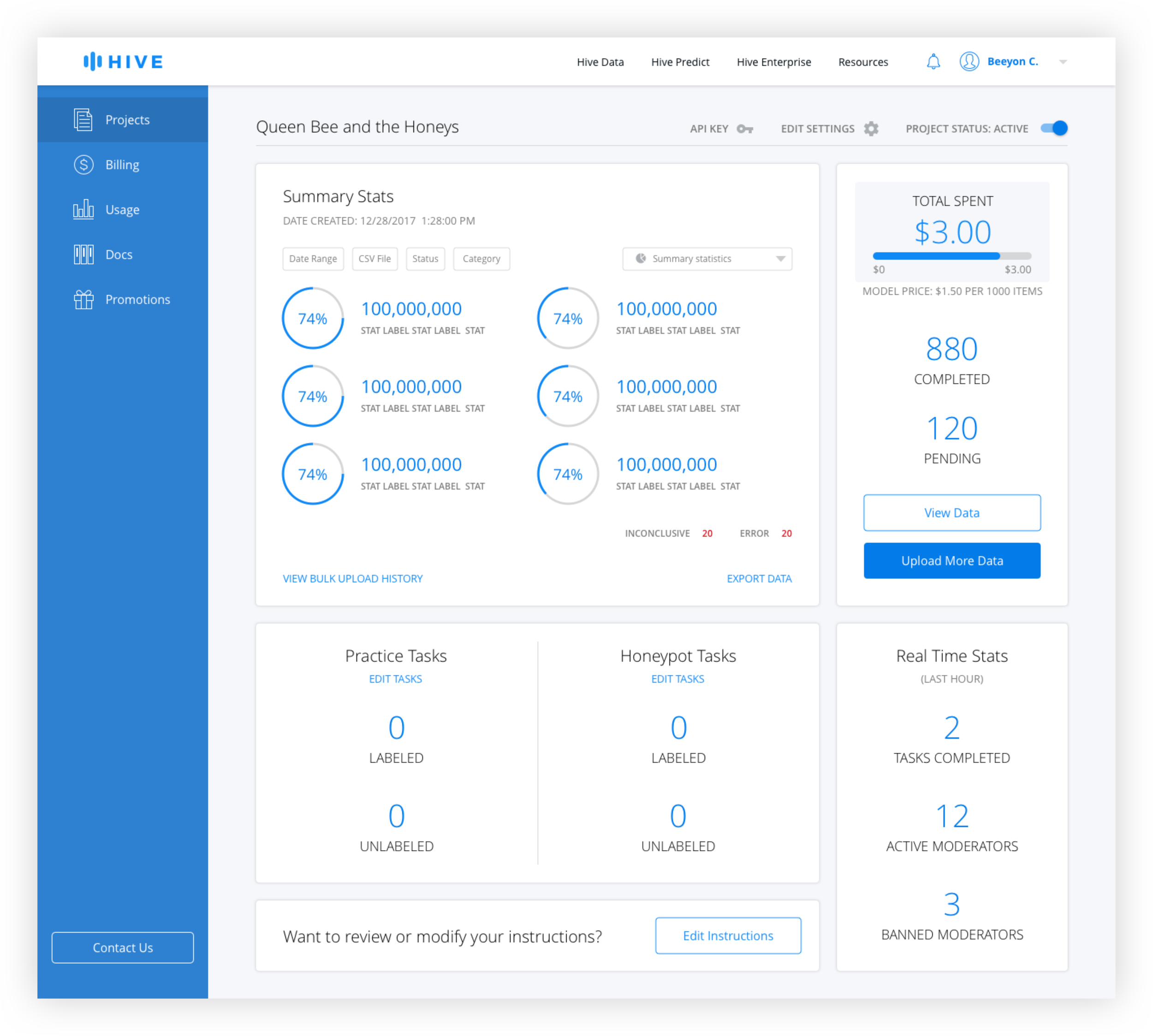
The old design features an "Export Data" text link in the data module of the dashboard that brings the user to a separate page. Users have the ability to select the date range and a table displays the history of exported data sets. This design included a number of redundancies such as date ranges for both the date module and the export page and required the users to click "Export Data" on two separate pages before download began. The Bulk Upload History page was separated from the Data Export page, requiring the user to switch back to the dashboard if they wanted to change views.
User Research
At first, the scope of the project was to redesign the table to reflect the new table styles and add more filters. But as I was interviewing our developers and data scientists, I discovered a number of other pain points.

Ryan - Data Scientist
Wants the ability to filter by CSV uploaded and to see data summary

Andrew - Developer
Wants the ability to show number of rows before exporting data

Howard - Engineer
Has no issues with current design. Any changes would have to be similar in function to current one.
Solution
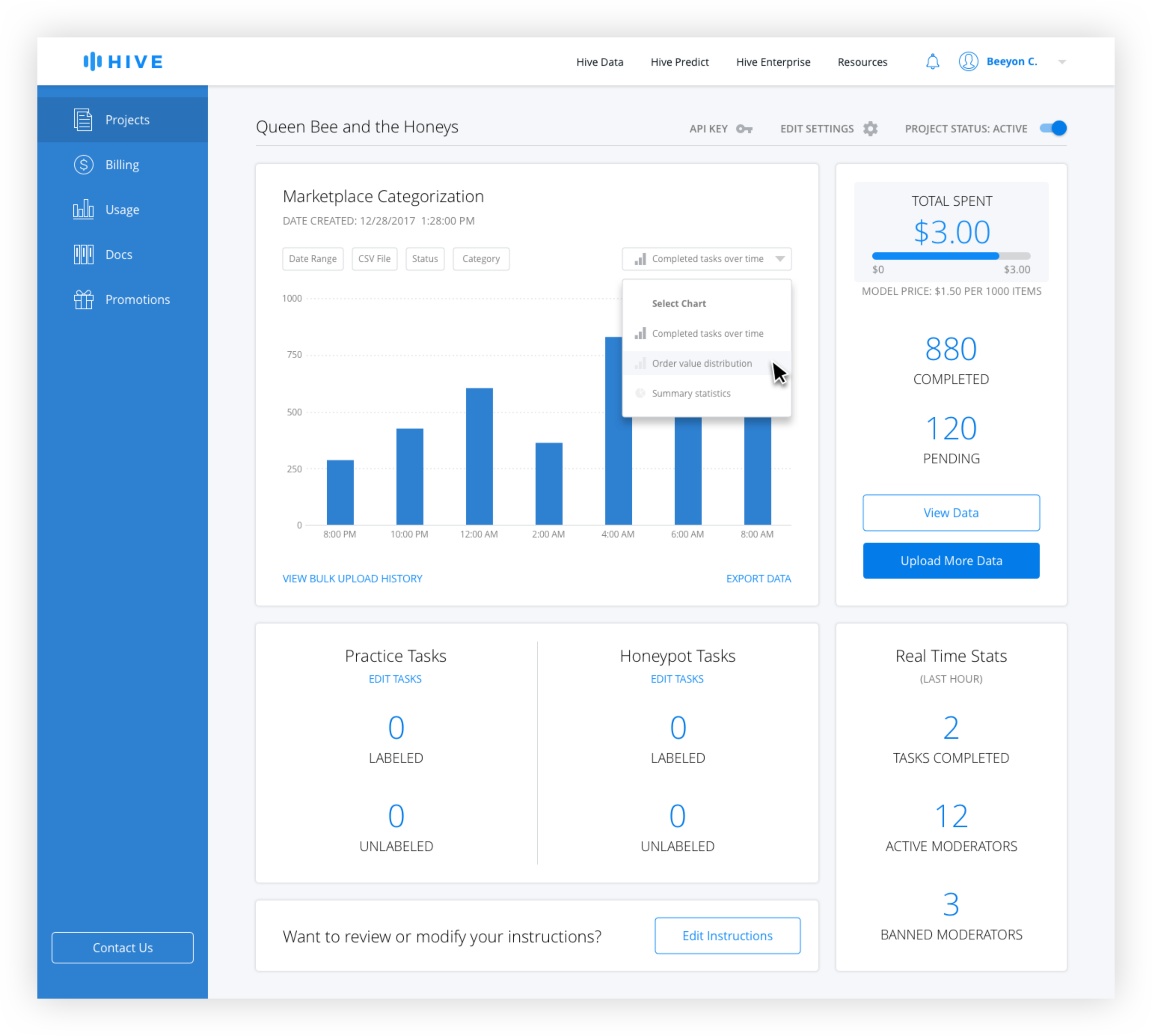
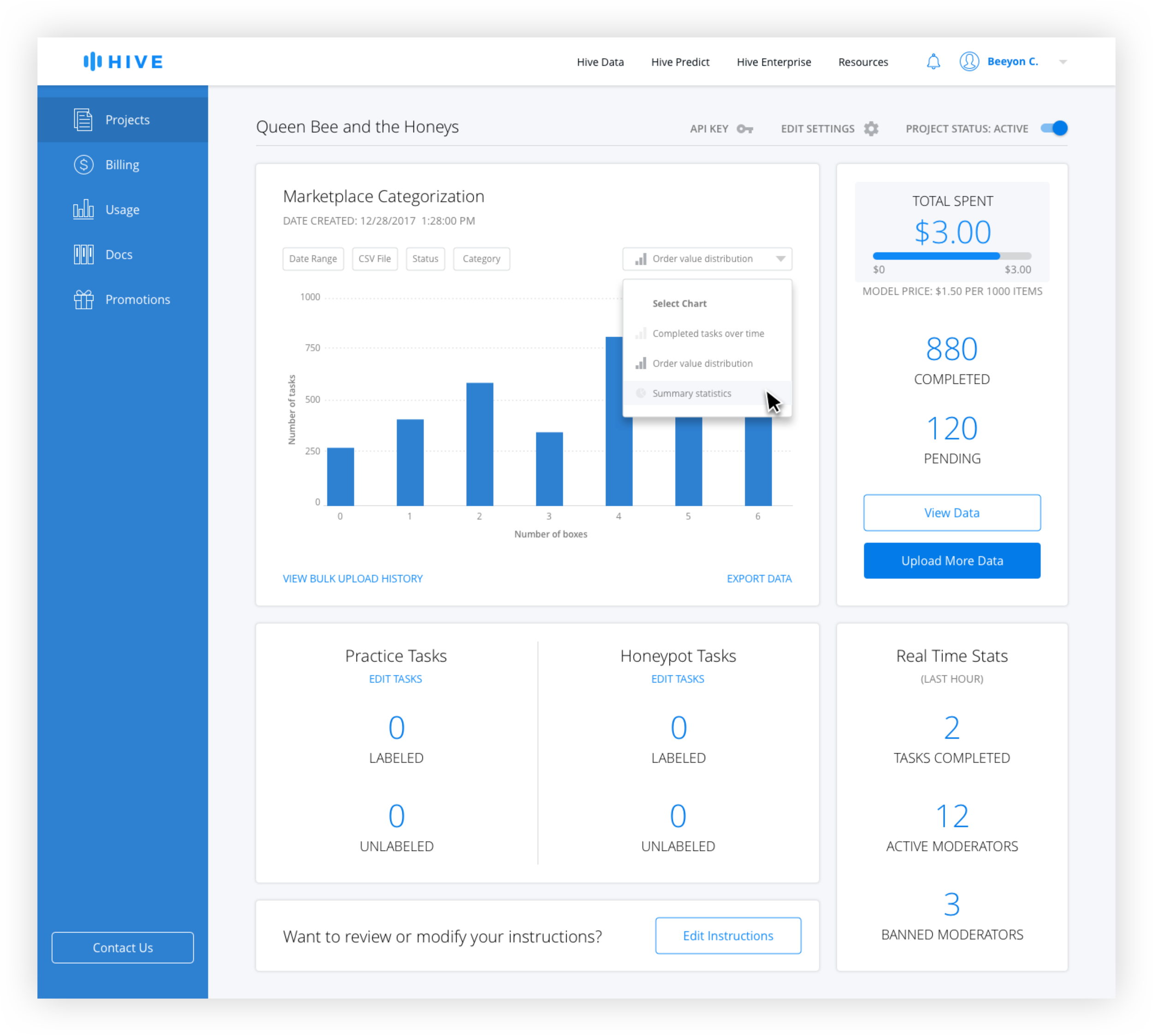
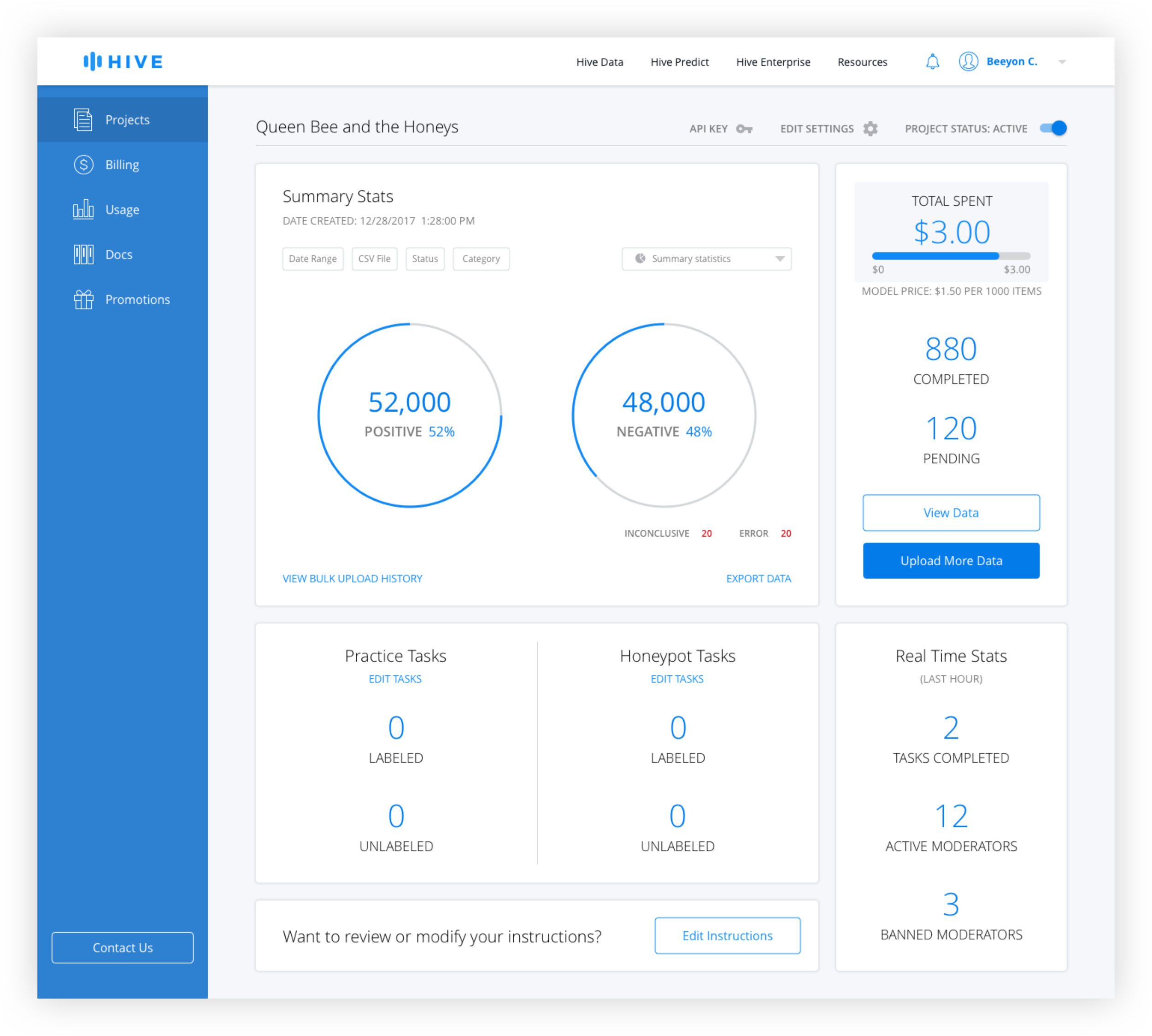
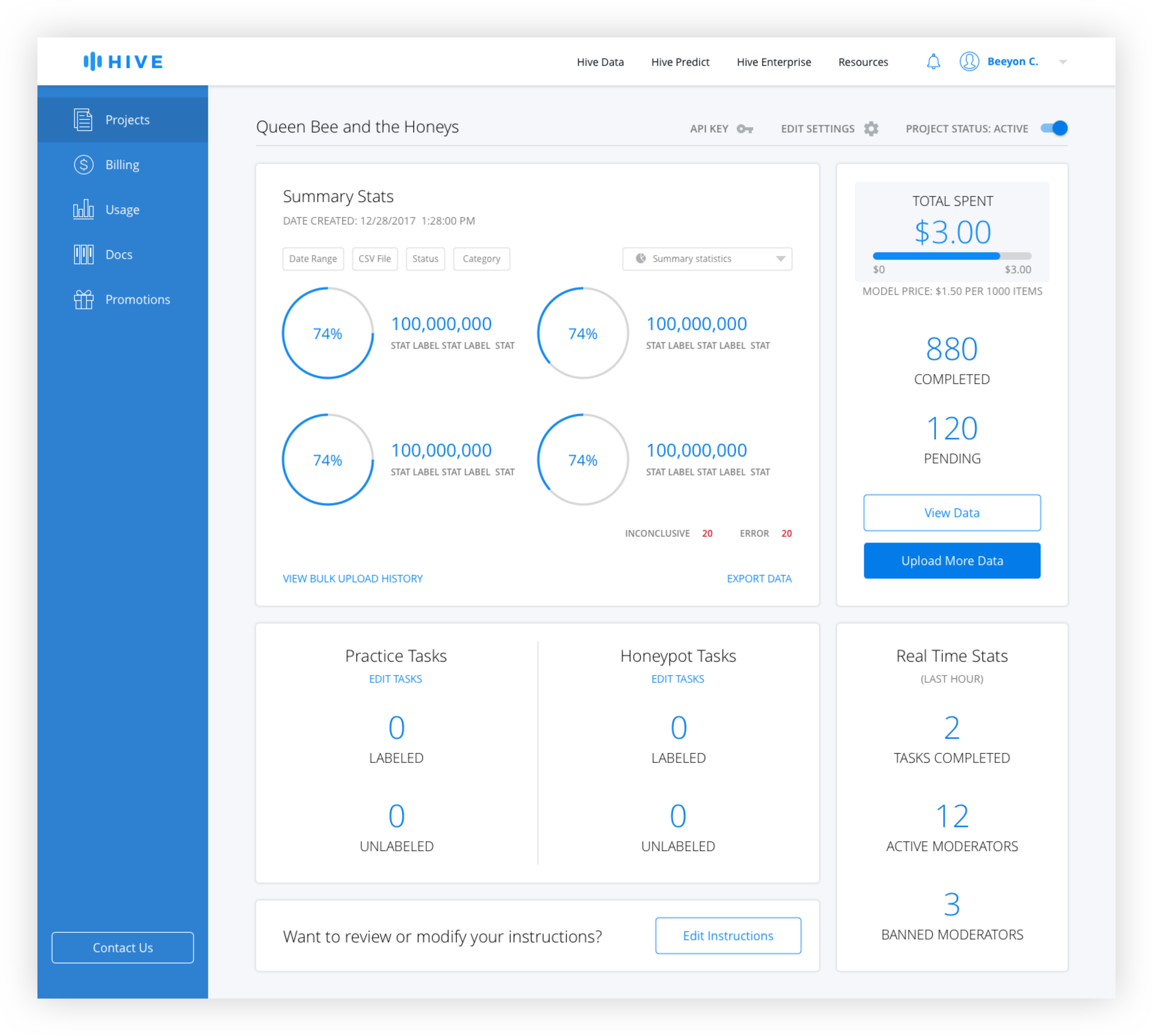
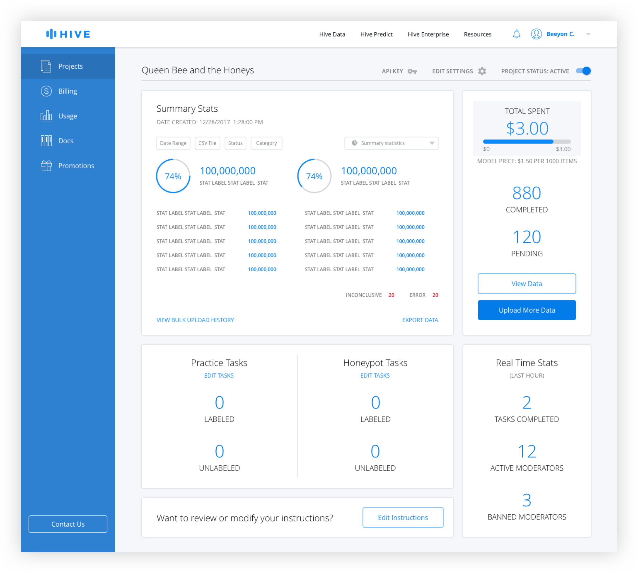
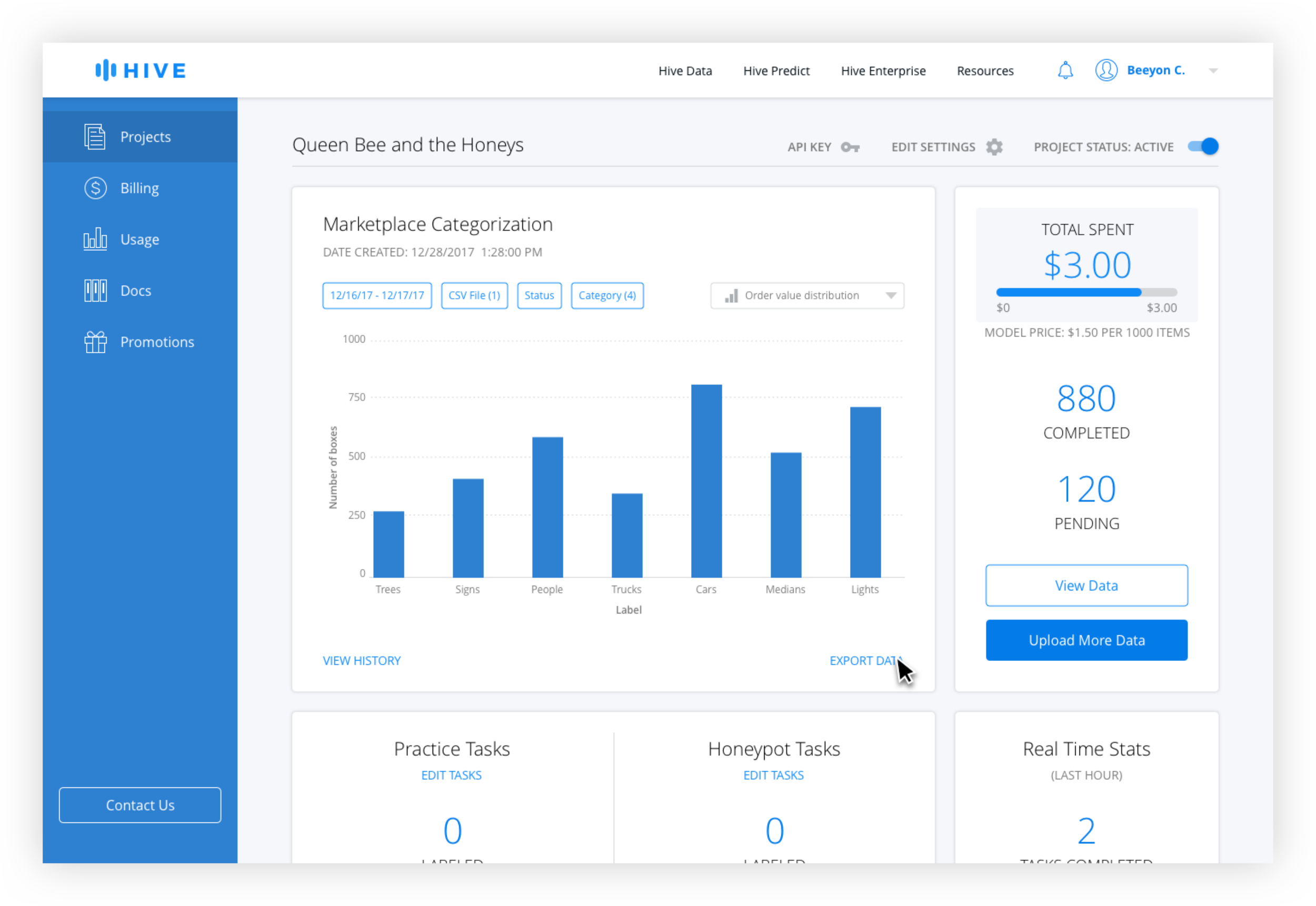
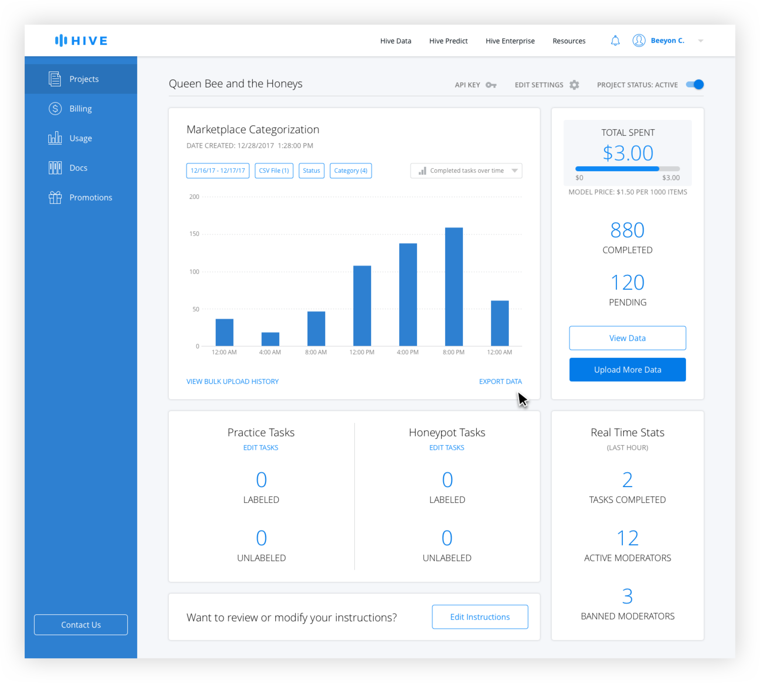
After interviewing developers, better filtering options and the ability to easily see summary stats were identified as the top features desired. Because it made sense to allow users to customize the data shown, additional filters were added, including search by CSV, which was highly requested. A chart dropdown allows the user to see different types of charts including distribution over times and values, and a summary page.
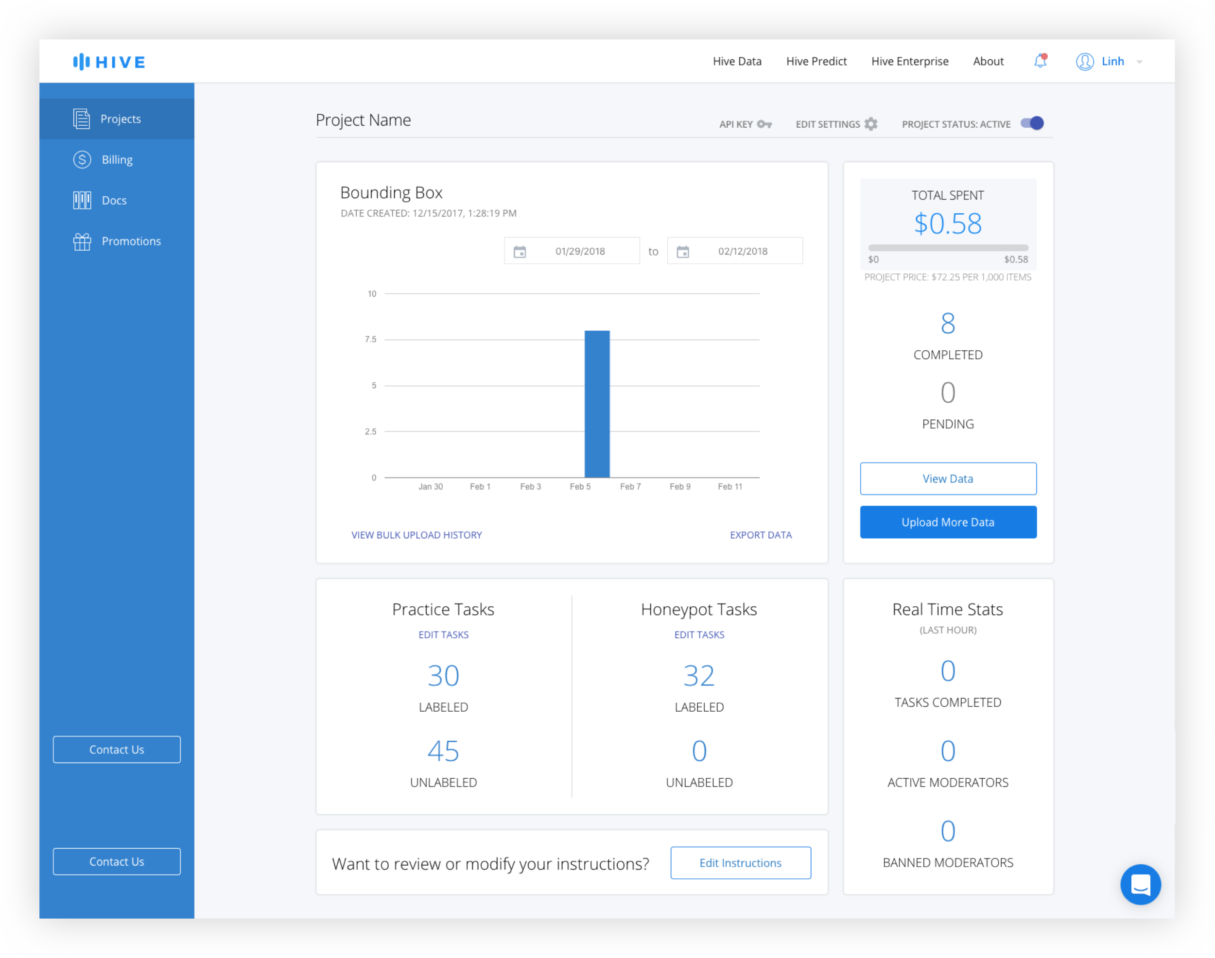
Rather than bring the user to an Export Data page and building another data view, which would have been redundant, the export function was brought out of that page and on to the dashboard itself. This way, instead of being brought to another page where they would have to reinsert the same parameters, the user could use the filters already active to download the data they are currently viewing.
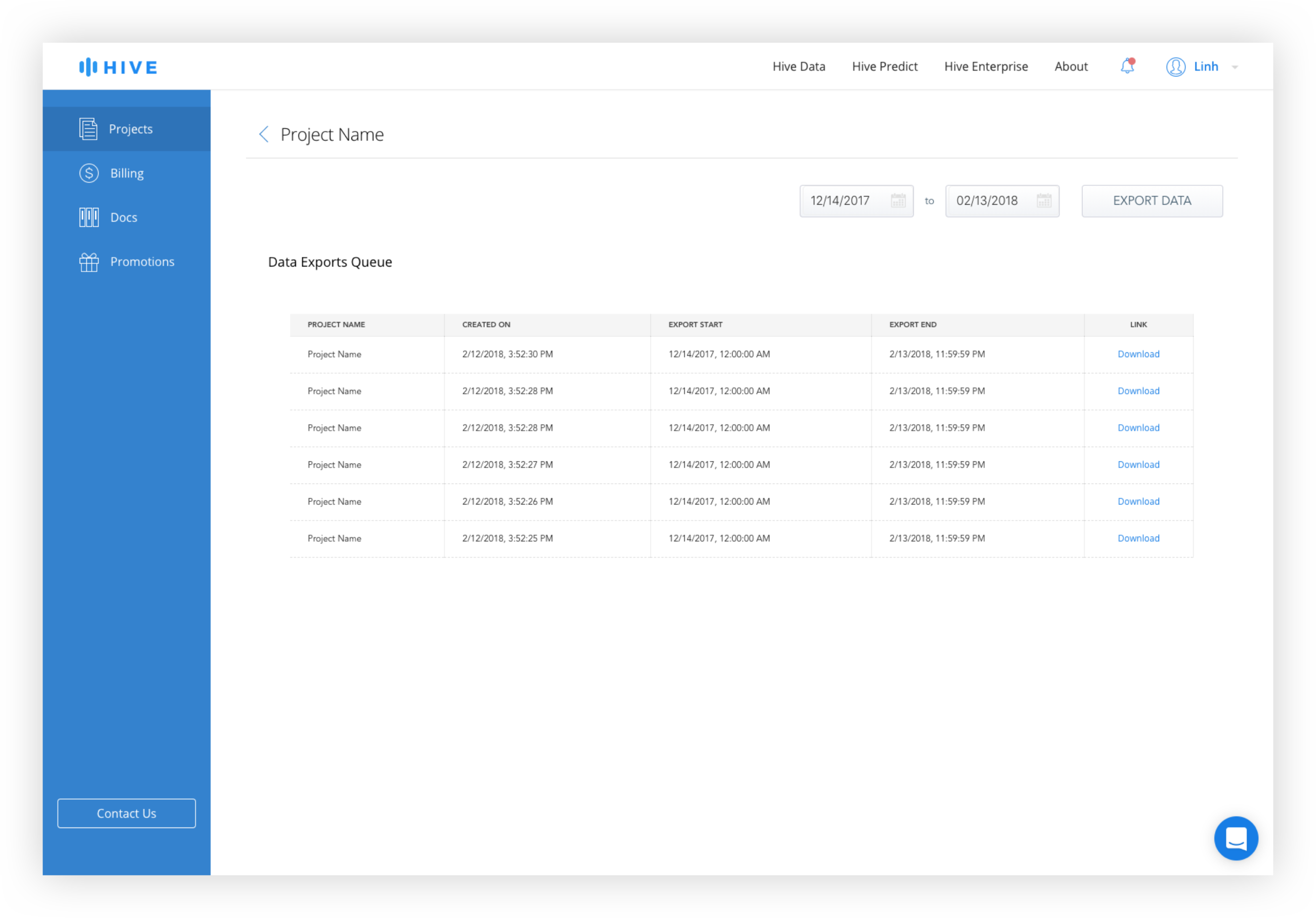
The Bulk Upload History and the Data Export Queue is combined into one page with tabs for easy switching between upload and download history.
User Flow

Wireframes
Export Data Queue and Bulk Upload History

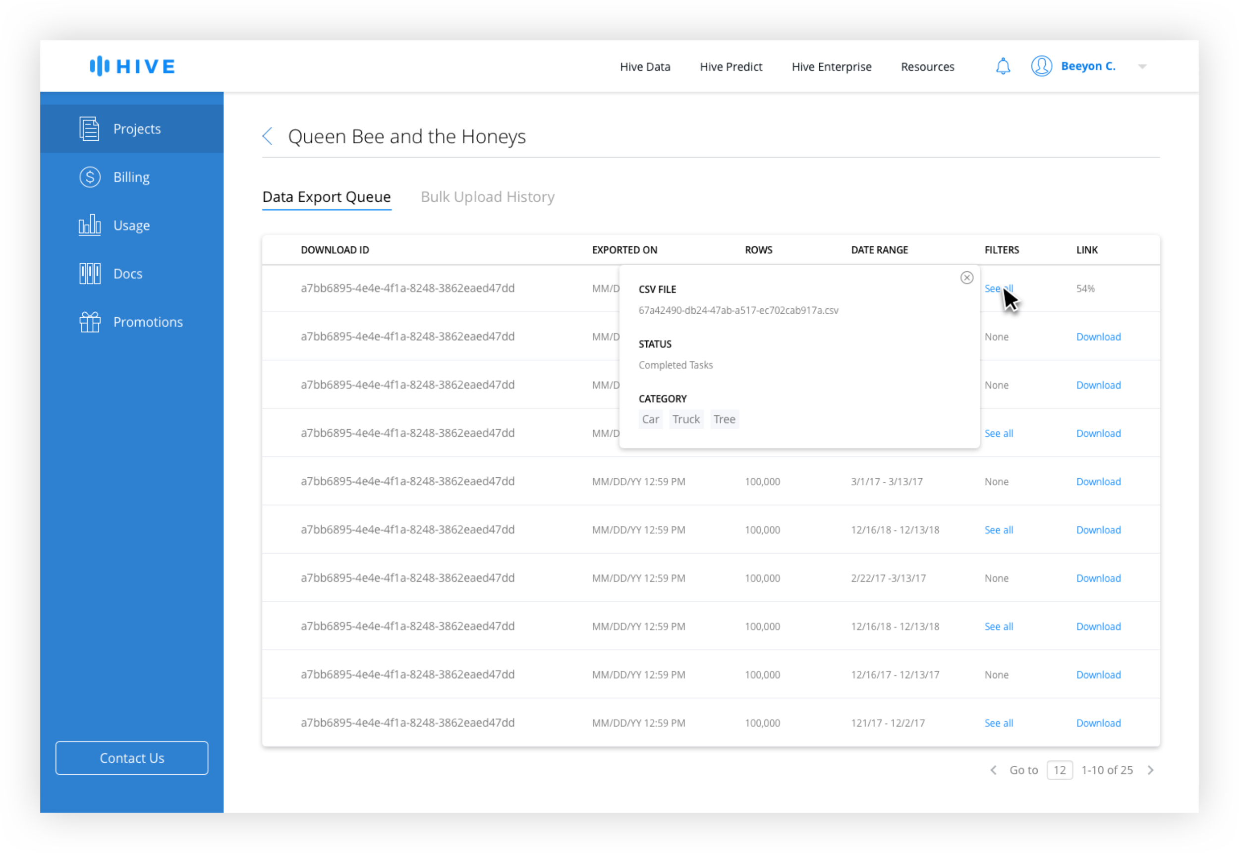

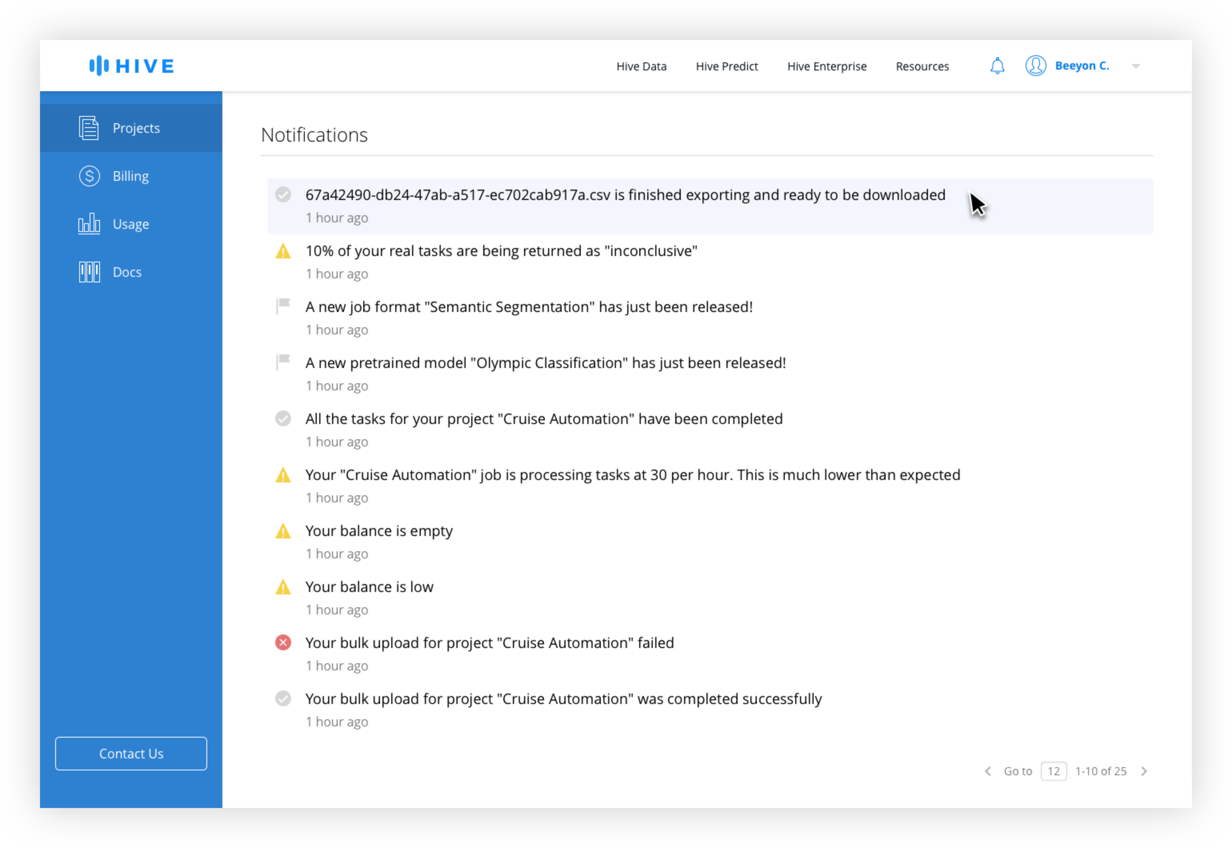
Because the size of data sets varied from tens to tens of thousands of rows, the time to prepare the download can vary significantly, meaning that a download might not be immediate. In order to signal to the user that an active download is occuring, they will be taken to the Data History Queue page after clicking "Export Data".
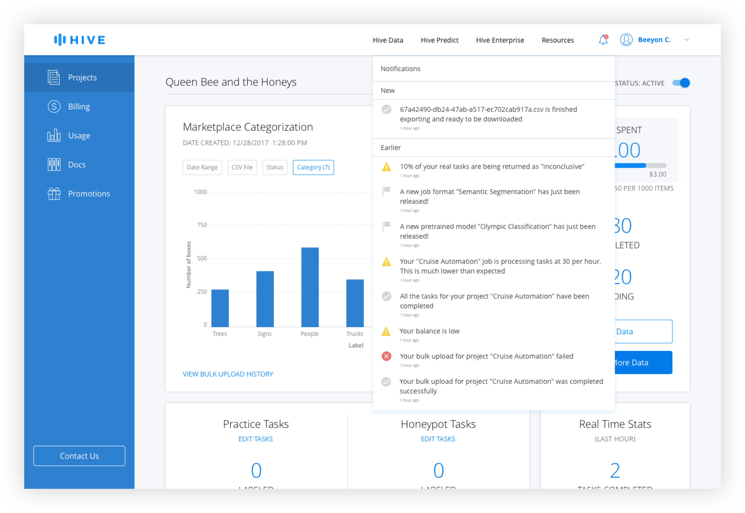
The table would be ordered chronologically with the most recent download at the top. If the export set is small enough, it would be available to download immediately. If processing takes a while, there is a progress indicator in the table and the user will receive a notification if they navigate away from the page.
Keeping the Upload and Download Histories together allows a user to easily switch between the two views without having to navigate back to the dashboard.
Dashboard Filters
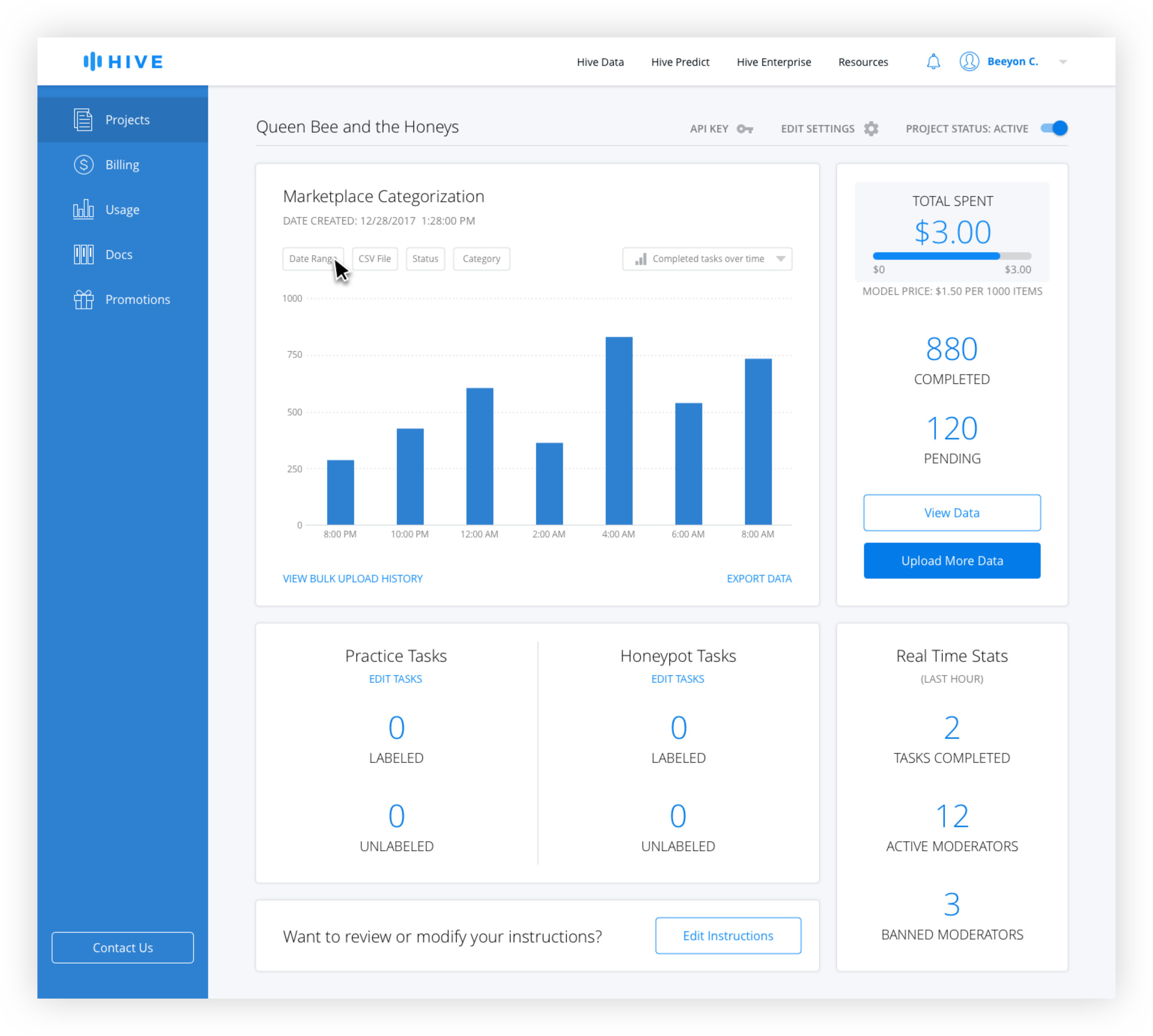


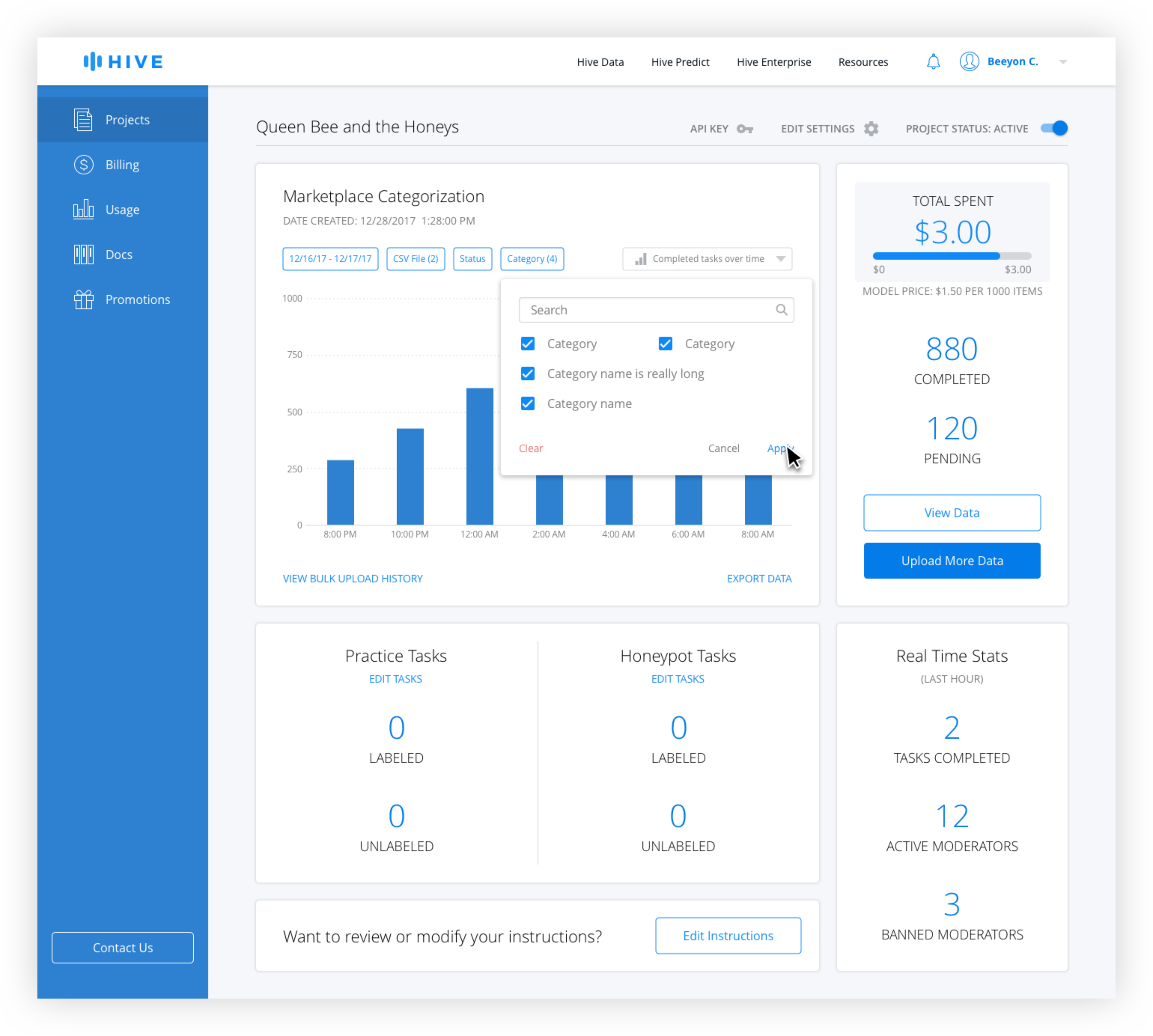
Active filters are blue and inactive filters are gray. The date range is technically always active, but the default is from the beginning of the project the the current date and time. Only when the user changes the date range does it appear active with the selection in the filter button.
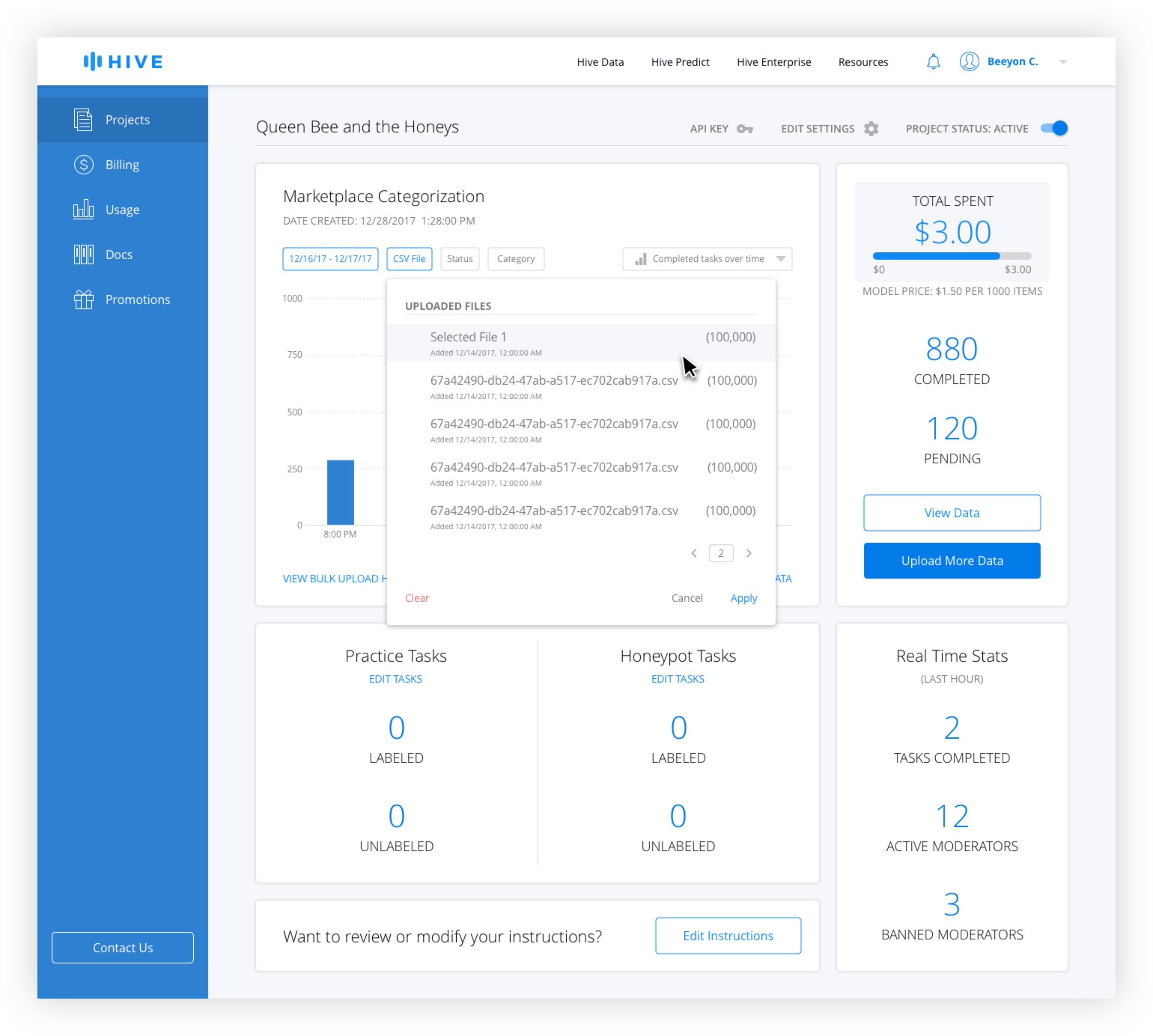
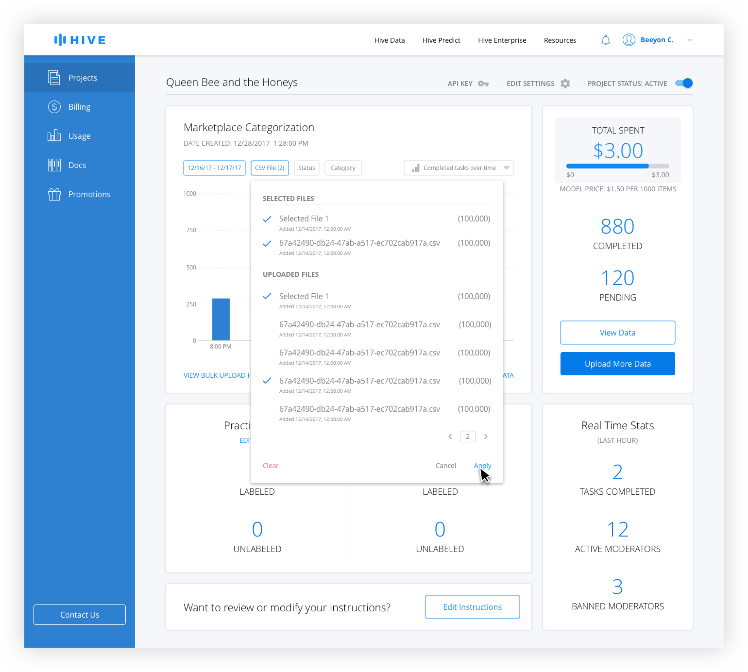
For the CSV filter, generally only the most recently uploaded ones are used for export, but the ability to access older ones was needed. Because the name tends to give little information to the user the number of rows and date uploaded is necessary. Because there is no limit on uploads, pagination is used instead of scrolling.
Chart Types